Graphic Design Principles
Introduction
A full discussion is beyond the scope of these web pages, as well as my own personal knowledge. Most of what I've learned has come from one of two sources. First, there are a number of web sites related to web design as well as graphic design. These pages provide a wealth of resources from basic information to advanced articles. Second, there are a series of books by Author Robin Williams (not the comedian) published by Peachpit Press, entitled The Non-Designers series. There are books about general design, typography, and web design. I have found Williams to be an engaging author who explains concepts in an easy to understand way. The information on this page is taken primarily from her series of books.
Proximity
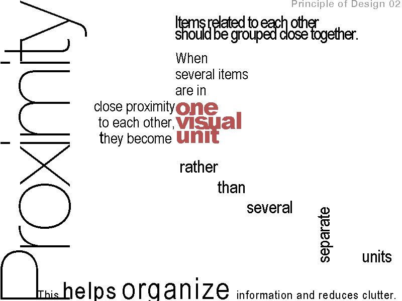
 The concept of proximity says that related items should be grouped together. Likewise, items that are not related should not be close to each other. The process of grouping related information creates visual cues, which accomplishes Jakob's principle of facilitating scanning. An example of proximity is the relationship between subheading for my paragraphs (such as Proximity above), and the Paragraphs below them. Williams also suggests never having the same amount of white space between elements that aren't a part of a list.
Alignment
 The concept of alignment says that everything on a page should be visually connected to something else on the page. Nothing should be placed arbitrarily. When elements are aligned they are connected to each other, even if they are separated on the page. You may have noticed that the alignment of the subheading "Alignment" left aligned. As it is said, "Good design is transparent." The lack of alignment between the subhead and the related paragraph made your eye have to travel across the page, and it was probably enough for you to notice.
Repetition
The concept of repetition says that you repeat design elements throughout the entire piece. The element can be a font style, graphic, line, icons, colors, the list is endless. The web makes this easy to do in several ways. First there are style sheets, which allow you to set elements of a web page to certain fonts, colors, locations on the screen, etc. It is fairly easy, and I recommend you copy my stylesheet, just to see what one looks like. If nothing else, add the style information for "A:Hover", it will makes links change color when the user mouses over them.
Contrast
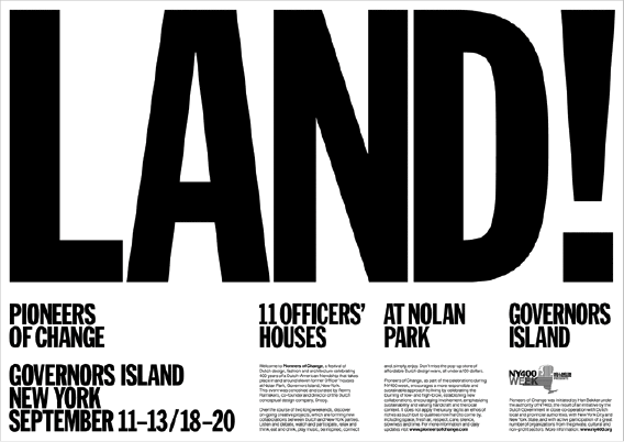
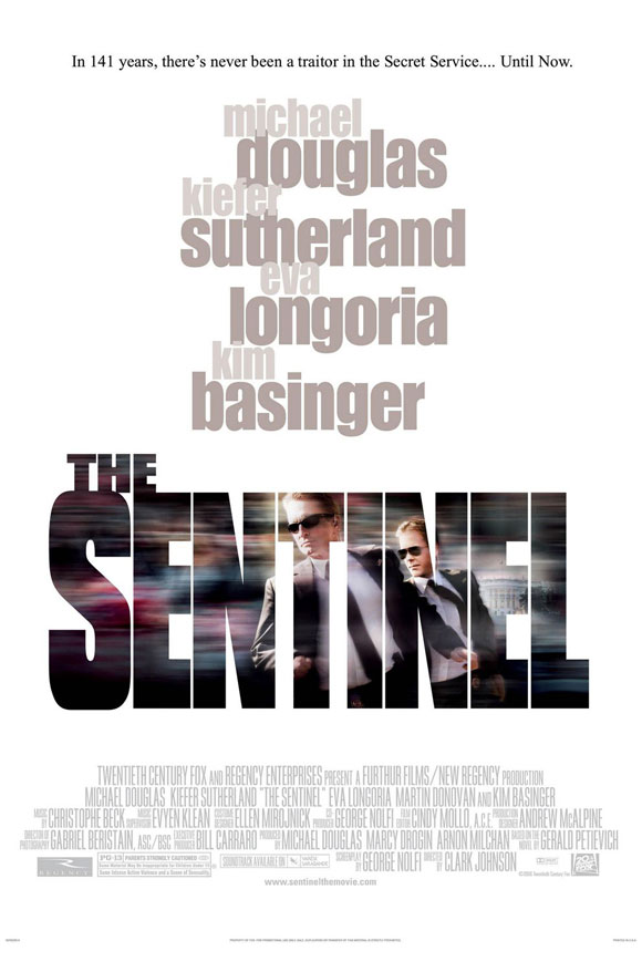
 The concept of contrast says that if two items aren't the same, make them very different. Contrast adds visual interest to your page. You can create visual interest by using color (as in the banner portion of this page contrasted with the content space), size and weight (as in the contrast between the headings and the paragraphs in font and weight), or any other property of an element. Again, you can utilize style sheets to make this easier by setting contrasting values for heading font and paragraph font.
Typography
 Typography is actually quite a large field of interest. It is beyond the scope of this document to cover all the elements of typography in much detail. There are countless web sites related to typography in both print and the web, but rather than leaving you to go search for yourselves I'll give you these very nice pages I found on typography and fonts maintained by Frank Boumphrey. There are also some pages regarding CSS Style Sheets. Typography can have a very profound affect on your work. Unfortunately, the web is still somewhat limited in using fonts. Web designers are forced to use whatever fonts may be on a user's system. Still, style sheets can help you easily set up font choices that look nice and will work on most systems.